Choropleth Maps in Python
Choropleth maps are a great way to represent geographical data. I have done a basic implementation of two different data sets. I have used jupyter notebook to show the plots.
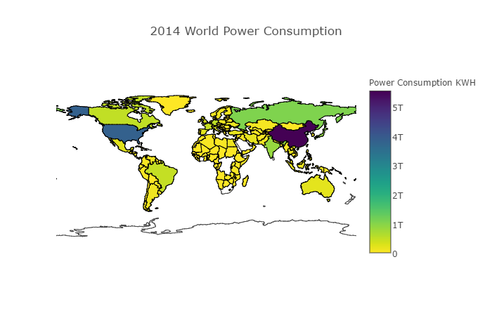
World Power Consumption 2014
First do Plotly imports
import plotly.graph_objs as go
from plotly.offline import init_notebook_mode,iplot
init_notebook_mode(connected=True)
Next step is to fetch the dataset, we’ll use Python pandas library to read the read the csv file
import pandas as pd
df = pd.read_csv('2014_World_Power_Consumption')
Next, we need to create data and layout variable which contains a dict
data = dict(type='choropleth',locations = df['Country'], locationmode = 'country names', z = df['Power Consumption KWH'], text = df['Country'], colorbar = {'title':'Power Consumption KWH'}, colorscale = 'Viridis', reversescale = True) ``` Let's make a layout
layout = dict(title='2014 World Power Consumption', geo = dict(showframe=False,projection={'type':'Mercator'})) ```Pass the data and layout and plot using iplot
choromap = go.Figure(data = [data],layout = layout) iplot(choromap,validate=False) ```The output will be be like below:

Check github for full code.
In next post I will try to make a choropleth for a different data set.
https://www.udemy.com/python-for-data-science-and-machine-learning-bootcamp https://plot.ly/python/choropleth-maps/